
What's new in Mashgin Cloud
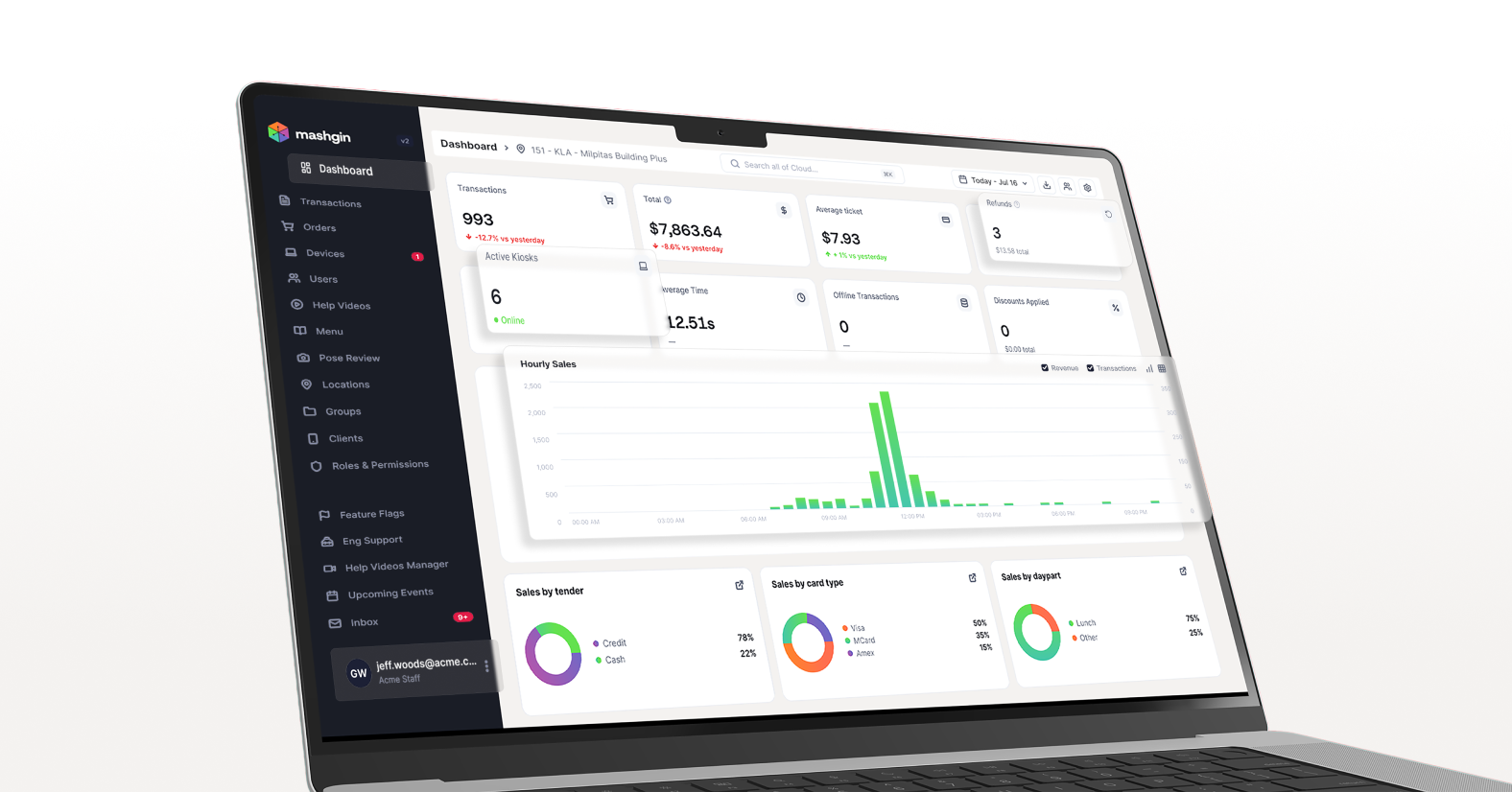
A fresh look for Mashgin Cloud
Mashgin Cloud is where operators go to actually run the show — setting up menus, reviewing sales and transactions, getting insights on buying trends, and customizing their Mashgin experience. We've added a lot over the years and have been quietly rebuilding to make the whole experience smoother. Today we're excited to share that a redesigned Cloud V2 experience is beginning to roll out.
The updated Cloud is easier to scan, quicker to navigate, and built around the workflows you reach for every day.
One important note up front, because we know it's your first question: your current Cloud experience isn't going away yet. Everyone gets a few weeks to try the V2 experience in beta. On September 4, 2026, V2 becomes the default.
Here's a quick look at the upgrades:
- Find things faster — We tidied the sidebar and built a smarter search bar that finds what you mean, not just what you type.
- Review transactions in fewer clicks — Better filters, hover-to-preview trays, and refunds or receipt downloads straight from the list.
- See your whole fleet at once — Running multiple locations? See daily sales without clicking in, view a map of active locations, and filter down to specific groups.
- Manage users in one place — Set permissions, location access, and alert preferences from a single profile panel.
- Check your inbox — Alerts, product updates, and events now gather in one place.
- Know where things moved — A quick breakdown of where common navigation tools now live.
New visual design and faster navigation
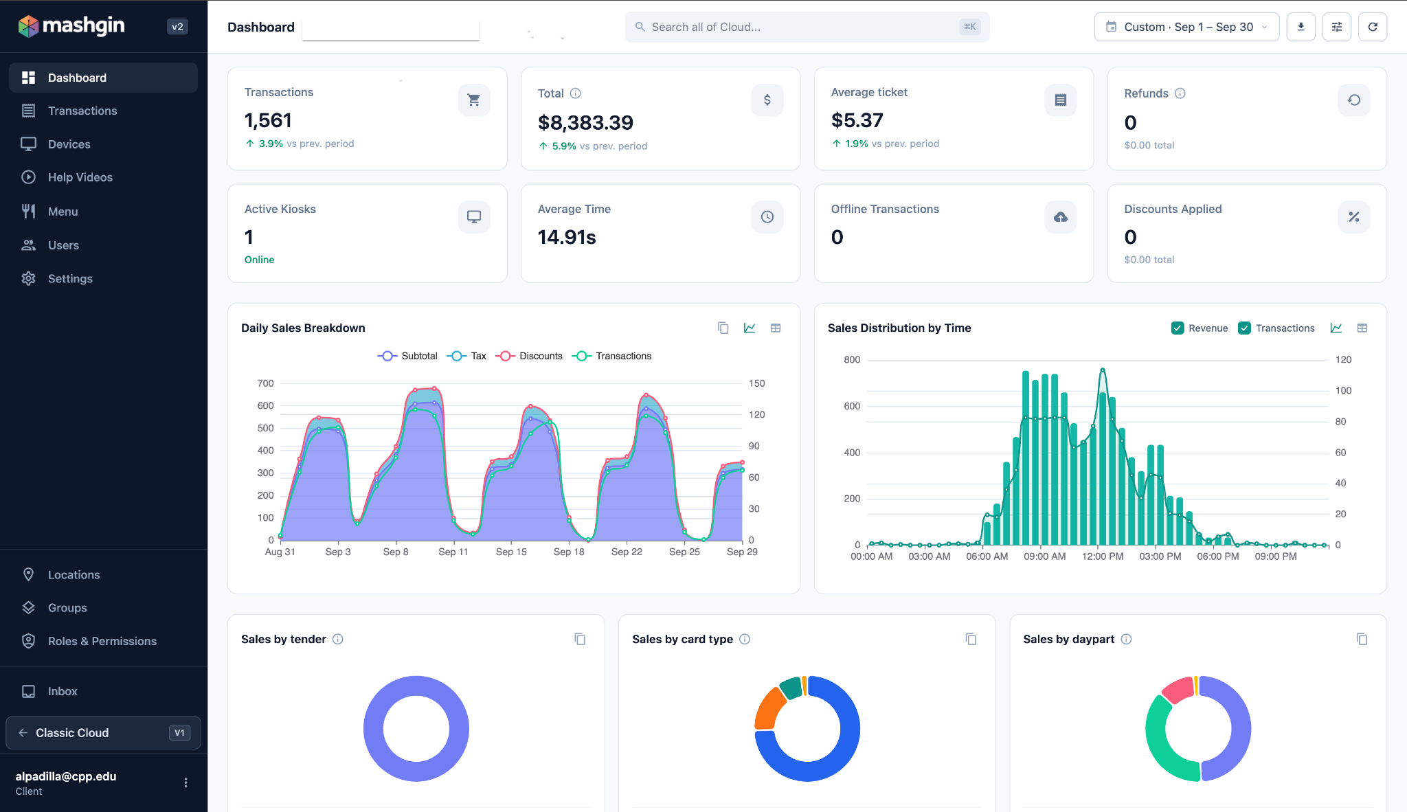
The first thing you'll notice is that Cloud V2 simply feels lighter. We refreshed the visual design to be less dense and easier on the eyes, so it's easier to find your way around.
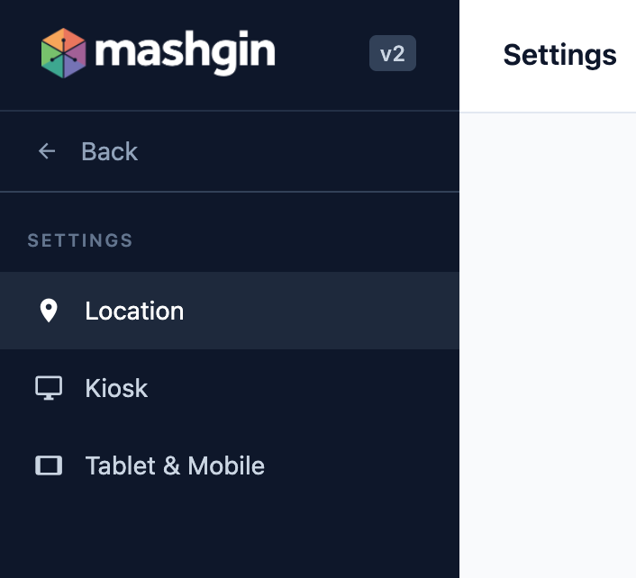
Settings got a sidebar, too. Once you're on the Settings page, a dedicated side navigation lets you jump between sections instead of scrolling.
Smarter search
The search bar uses fuzzy matching, so a close spelling still lands on the right result instead of returning nothing.
On most pages, search scopes itself automatically — what you type filters only that page's content. A chip at the start of the search bar tells you which page you're scoped to.
So searching on the Transactions page only searches transactions, not all of Cloud. Search scopes automatically on Transactions, Users, Devices, Locations, Groups, Permission Profiles, Help Videos, Events, and Settings. Need to widen the net? Click the chip's × to drop the scope and search everything.

Settings got a sidebar.
Once on the settings page, you’ll now spot a distinct side bar to quickly jump from section to section.
Of course if you’ve got a clear idea of what you’re looking for, smart search is still the fastest way to jump to it.
Easier transaction review
If you've ever had to track down one transaction to sort out a customer question or reconcile an odd number, you know it can turn into a scavenger hunt. Cloud V2 makes transaction review a lot quicker.
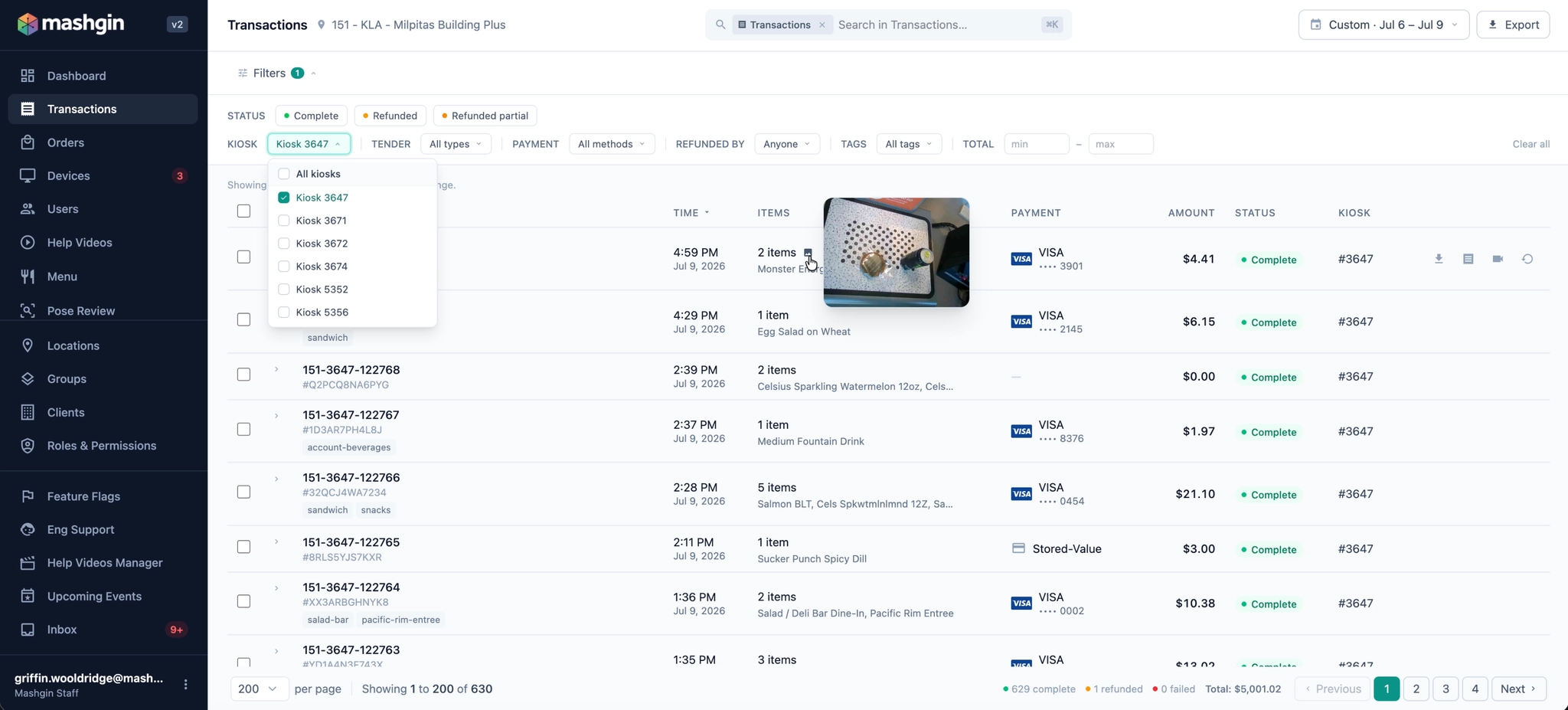
Transaction filters
You can now filter by kiosk, tender, card brand, refunds, amount, and tags to narrow a busy day down to exactly the transactions you care about.
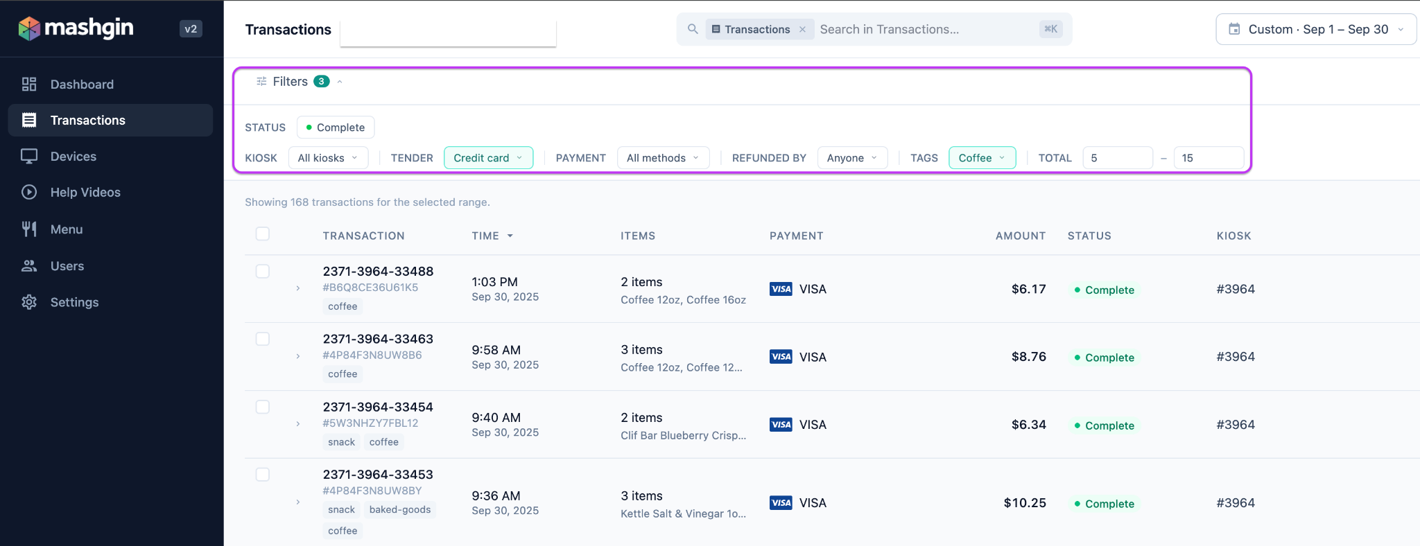
Tags make this especially flexible: you can mark your menu items with multiple tags, then isolate specific transaction types and spot trends.
Hover to preview a cart
Confirming what a customer actually bought no longer takes a second page load. Hover over the "items" column of a transaction and a small image icon appears next to the item total. Put your cursor on it to load the tray image right there.
Take action without leaving the list
The actions you used to have to dig for now live right in the list: view or download a receipt or issue a refund, without leaving the page. When your cursor is anywhere on a transaction, you’ll see three icons appear on the right side of the screen that let you take instant action.
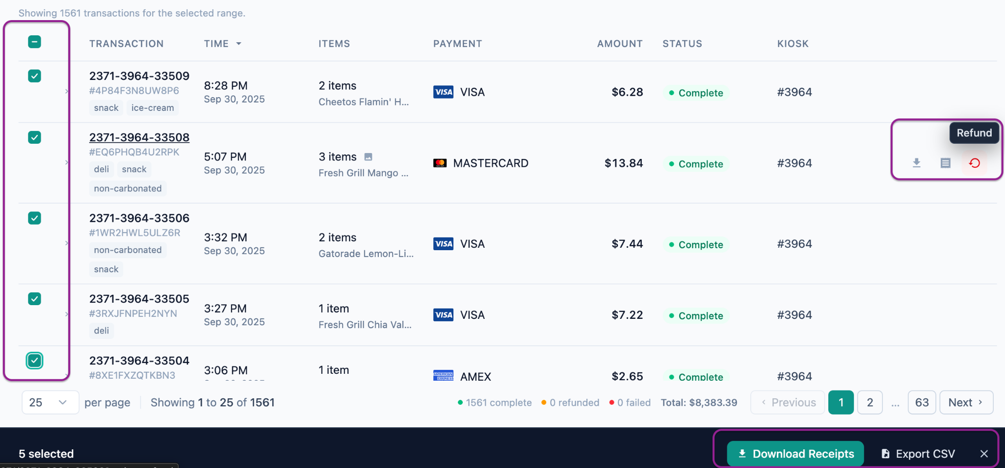
Another handy feature is the ability to bulk download receipts (or export them as a csv). Simply check the boxes next to each transaction you want to download, or lock in a few filters and click the box in the upper left to quickly check all transactions that meet your criteria.
Your fleet at a glance
We've added today's sales to the Locations tab so you can see how the day is going across every site without opening each one.
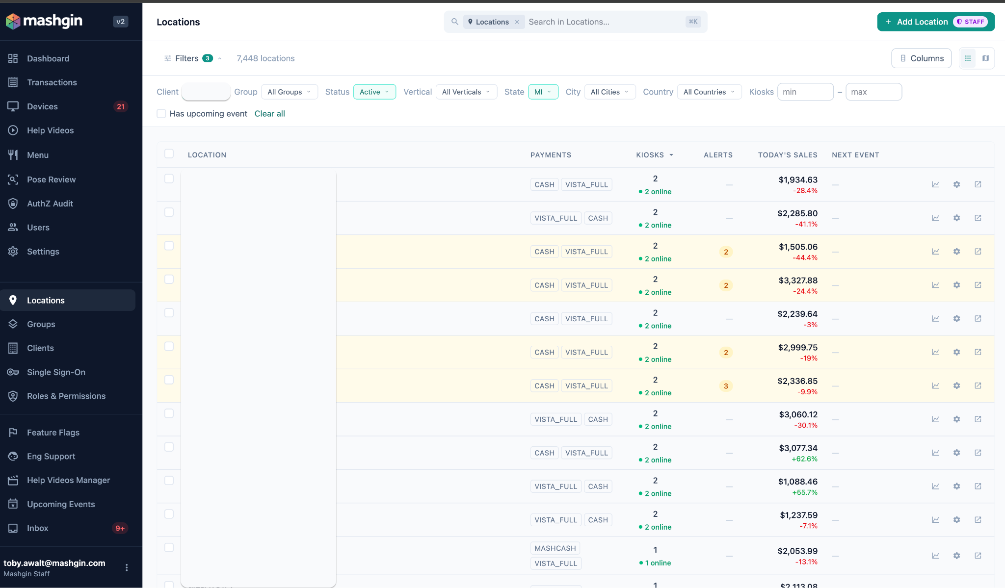
You can also filter locations by state, city, vertical, or kiosk count to home in on and compare specific location types.
Locations on a map
A new map view with filters lets you see your locations spatially. Great for understanding your kiosk fleet distribution at a glance. Map mode also utilizes the filters placed at the top of the locations page.
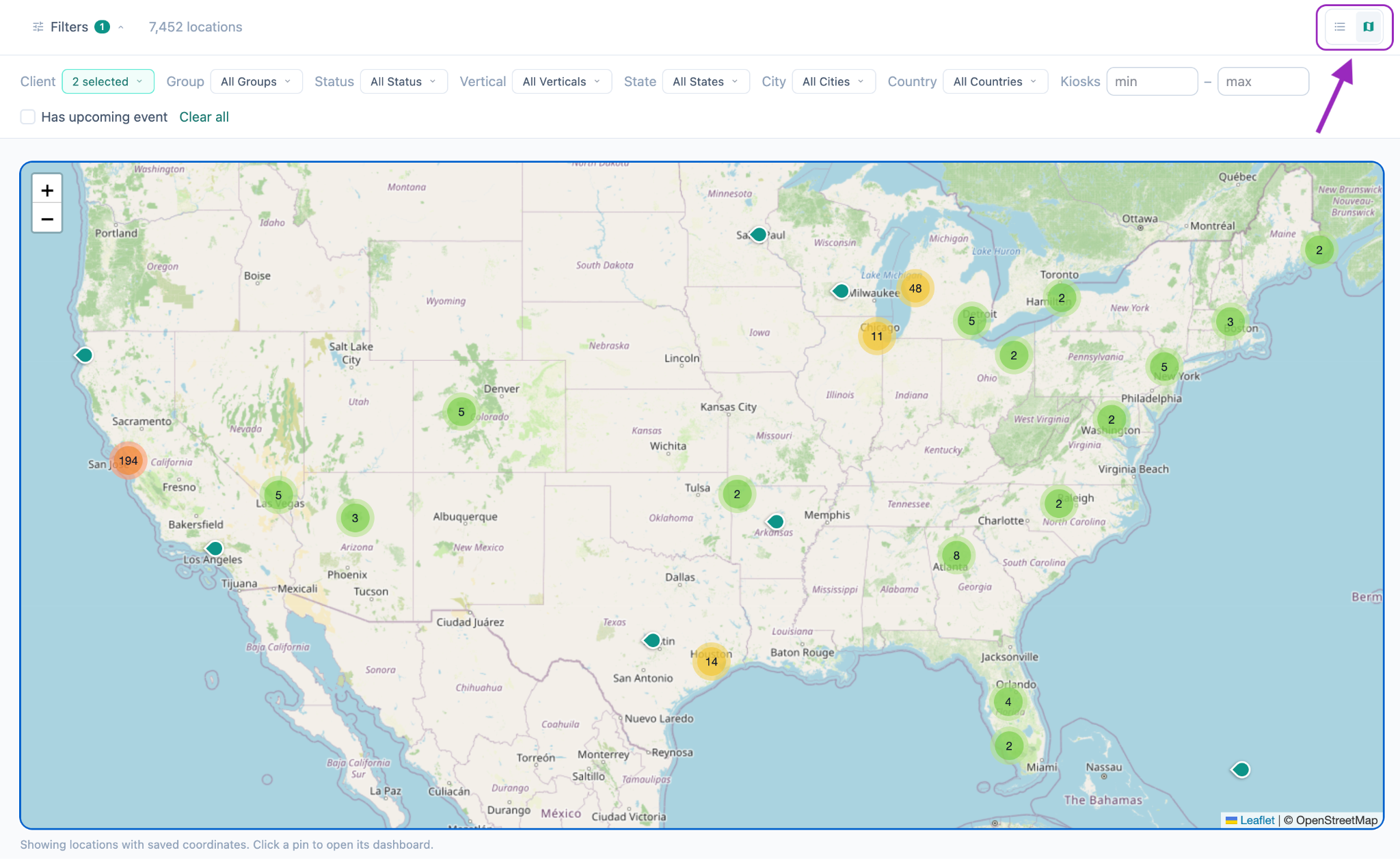
Access map mode by clicking the small map icon in the upper right corner.
Improved user management and settings
User management is now centralized. See all your users in one view, and set each person's permissions, location access, and contact preferences in one place.
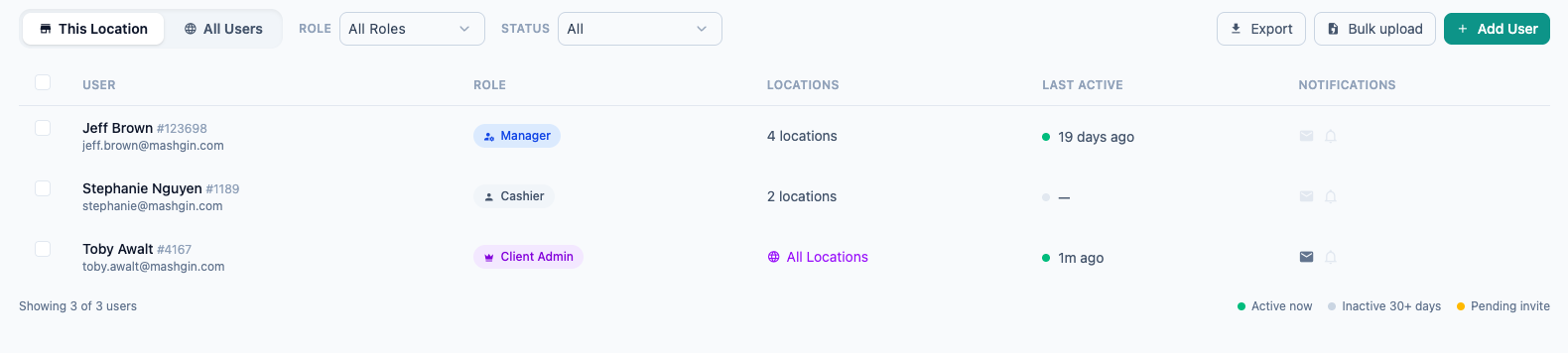
Just click into any user to open and edit their profile in a sidebar on the right. We've made it easy to add phone numbers and to choose which alerts go to text and which go to email — just check the box for each.
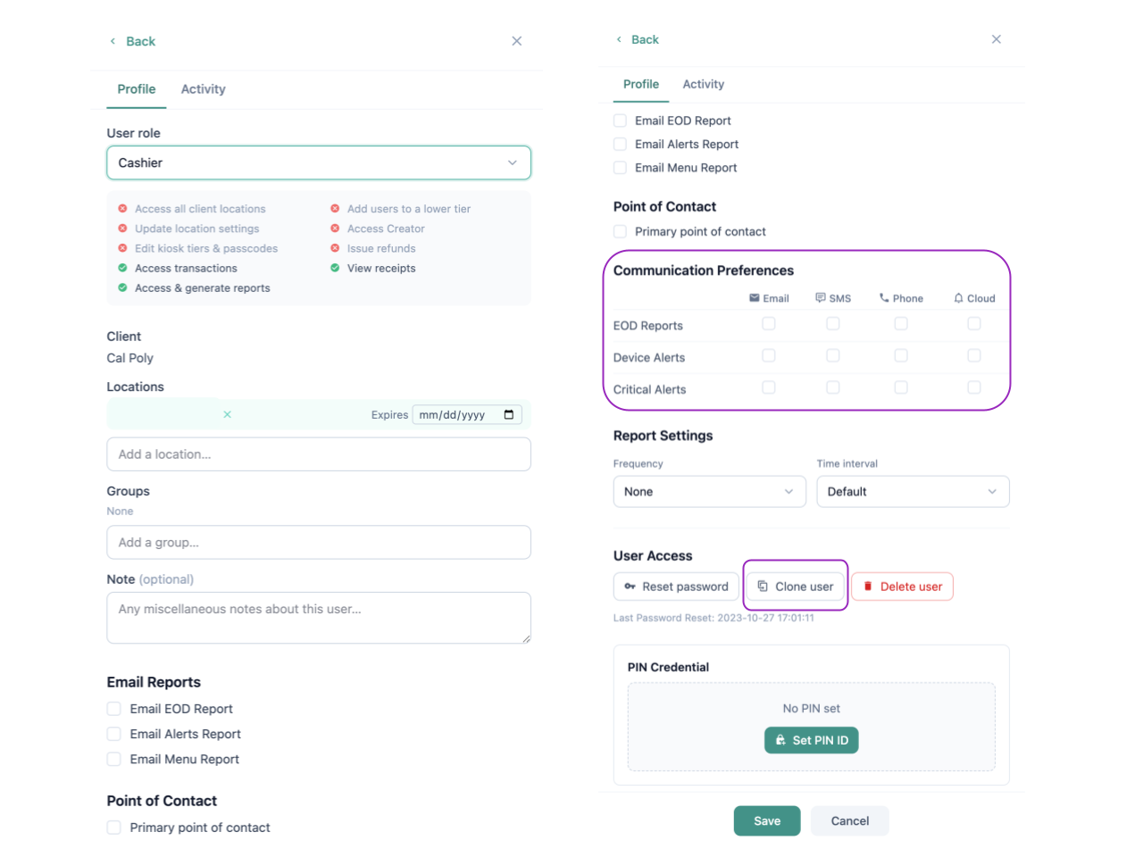
We’ve also made it quick to clone a user - great for when you want to quickly build multiple users that share a role and set of locations.
An inbox for everything worth knowing
A new Inbox gathers alerts and product release notes. Instead of hunting through emails and docs to stay current, operators get a single spot to catch what's important.
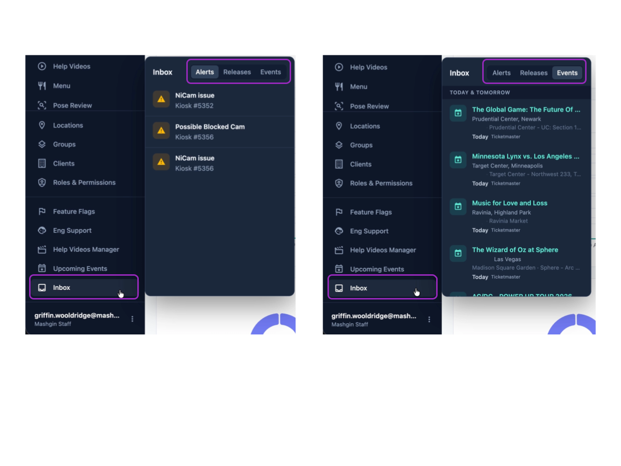
If you’re operating a venue with an event calendar, events will also populate as a tab to help you keep track.
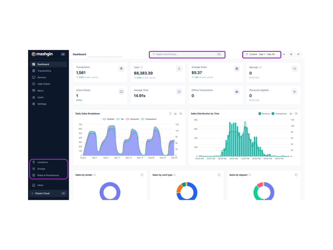
A few things moved:
- Date ranges are now in the upper right-hand corner of the dashboard.
- The search bar now lives in the top middle of the screen.
- Locations, groups, and Permission Profiles now live near the bottom of the sidebar.
Rolling out now
The updated Cloud V2 is beginning to roll out, and some capabilities arrive by location or feature flag, so you may see pieces of this land over time rather than all at once. If you see something here that hasn't reached your account yet, contact support.
This is a big update, and we're not done. Keep an eye on your new inbox for what's next.

By providing your phone number or initiating a text conversation with Mashgin, you consent to receive SMS messages related to support updates, existing cases, account notifications, and service alerts.Message frequency may vary. Message and data rates may apply. You can reply STOP at any time to opt out.For more information, please review our Privacy Policy and Terms of Service.